Posted on January 23, 2015 at 7:24 pm
Everyone is building a website these days. Some are doing it for fun while others are purely into it for the money. Whatever your reasons may be; If you have asked about web design in Milton Keynes, you probably have heard stories of people who went through horror-like experiences with a web developer. If this has happened to you or if you want to avoid such circumstances; read on. In this article we provide you with the necessary tips to help you and give you the insight you need to make the right decisions as you hire your next web designer. To make it easier for you to grasp, we have outlined the top 4 things to consider look for in a web designer.
Ask
Web design in Milton Keynes is not a new thing. Your problem is finding the right guy and the best way to get a hold of this person is by asking around. Other people who have passed down this road probably know a web designer that is worth it and they will be more than happy to lead you to his direction. If you have nobody to ask, seek the services of search engines or social media websites. A good designer always has the backing of his previous clients. (more…)
Posted in Web Design
Posted on October 26, 2014 at 7:34 am
Looking to build a new site for your business? Today, a website is literally a must have for businesses. Apart from giving you a competitive edge, it offers an effective way to connect with your target market and establish your brand. When it comes to the web design part, many business owners prefer to hire website designers in Milton Keynes. This is not necessarily because they can’t be able to perform the job, but because of the numerous benefits they stand to gain by having a professional handle the work. Here are some of them.
- Are experts
You understand your industry very well. You know what works and what doesn’t, what can bring you more sales and what can’t, and so on. The point is that you’re an expert in that particular industry. Web designers are also the experts in their own industry! They speak, research and do the web. A professional designer will have undergone all the required training to work in the field. Moreover, they stay up to date with trends and advancements in the world of web design by continuously researching, reading blogs and attending seminars, for instance. They will also have vast experience building and designing sites for many different clients. (more…)
Posted in Web Design
Posted on August 18, 2014 at 8:52 pm
Websites are ultimately designed to either give information or sell a service or a product. Your target audience may differ depending on what industry you are in, but the main aim should be to make your site easy to use and professional for the end user. We often get a bit carried away with the Search Engine Optimisation of a site that we lose sight of what the customer actually wants. SEO plays a massive part in a websites success, but this needs to be balanced with usability to create a great site. If you are worried that your site has got over complicated, then take a step back, imagine you are a potential customer and try and use the site as if it was the first time you had visited it. If you struggle to do this then maybe find a family member or a friend and ask them to take a look. Sometimes we miss things that are actually fairly obvious. A website is all about balance and at the end of the day if it is not suitable for the visitor, the chances are they will leave.
Posted in Web Design
Posted on June 23, 2014 at 8:45 pm
One of the most amazing things about e-mail marketing is that you do not have to be an expert to create a good looking campaign. Majority of e-mail marketing service providers provide pre-designed templates for their clients to use. However, with already designed templates, you have a number of design decisions to make for instance the fonts to use, the colours, the size to make the fonts and also the text you should include. The following are some of the best Email marketing design tips you should know.
Include your logo each time in the same location
It is important to build your brand with every marketing electronic post you send. The best way to do this is by including your logo in all your communications in the same location. You might include it in the header or somewhere within the message. However, do not conceal it completely as this will prevent the reader from seeing it.
Always have the preview pane in mind
A study conducted by Marketing Sherpa shows that 70% of recipients with the ability to read an email through a preview pane actually do. This means that not all of your subscribers do actually read all your mails. Therefore to ensure that they read most if not all your messages, it is essential to include your logo as well as including some enticing information about what is contained in the email in the preview pane. This will get them interested into reading what is contained in your message.
Use colour for emphasis
Although it is good to use colour in your mails it is important to resist the urge to over use the colours. Use of a lot of colours might make your piece of mail look ugly and unattractive to your subscribers as well as readers. If you want to use colours it is advisable to use your company’s colours; colours that represent your brand. But for emphasis you can use colours that are outside your brand. You can use these unique colours to point out important things in your message for the reader to see, read and understand that particular thing with ease.
Reduce the number of fonts you apply
The recommended fonts to use for the best email marketing design are two fonts. For example you may use standard fonts like Times New Roma, Verdana or Arial. This is because they make it easy for the reader to see and read the contents of your message with ease. If you use or apply fonts that are less common, the computers of your subscribers and recipients might make substitutions that can entirely change the format of your electronic message.
Be precise and concise
When it comes to proper email marketing design, it is a good idea to always go straight to the point. It is important to point out that most people scan through messages they receive. They rarely give you the opportunity to capture their attention. Therefore if you go round in circles and fail to engage them you will definitely lose them. The first few words of your mail should be enticing and captivating to get your audience reading the remaining parts of the message.
Posted in Web Design
Posted on June 12, 2014 at 9:23 am
Designers, engineers, architects, and other creatives spend a lot of the day in front in their computers. It truly is where your complete work gets done, social relationships are made, and emails get treated. In point of fact, laptops and computers became a staple of recent lifestyle, and folk use much more devices to make their work more productive.
Today, I’d want to bring on your attention to twenty awe-inspiring and neat examples of sites with workspaces within the background. A whole bunch digital agencies, interior and website design studios, magazines, freelance workers, and people use their workspace as a background in their websites to indicate off where all of the creative ideas get born. It’s a special chance to take a look on the backstage of the creative process. Scroll down and revel in!
Electronic Brain

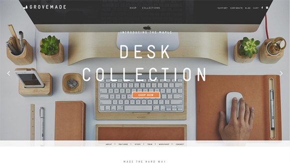
Grovemade

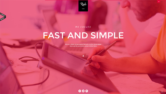
Ripple
Clever Birds

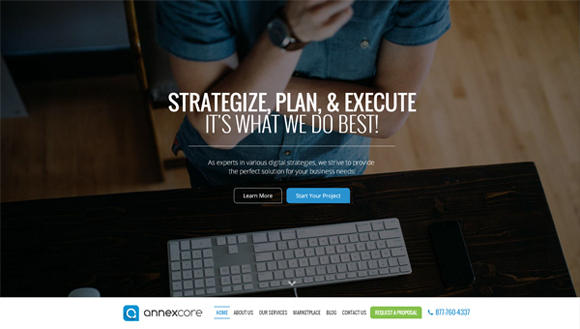
Annexcore
Love Carmen Rose

Loyalty Expert

Bright Byte

GCM Service Group

JK Design

The ABC of Cinema
 0
0
KIN
 1
1
New Deal Design
 2
2
Multifarious Engineering
 3
3
Cinnamon Toast
 4
4
Squarespace
 5
5
Online Department
 6
6
BKWLD
 7
7
Wearemammoth
 8
8
Best Designers Ever
 9
9
Posted in Web Design
Posted on June 10, 2014 at 4:40 pm
With rapidly growing mobile technologies, we’re ready to browse the net and do a load more operations with smartphones which earlier were available only on laptop. Checking your analytics would show that greater than 20% of users come on your site from mobile devices of various kinds, and this number is increasing day after day. Therefore, it’s quite essential to adapt to the constantly changing market and take a look at to delight the users. Restaurants, cafes, and other food-oriented establishments should contemplate specifically designed mobile applications that will avoid losing customers, and to also gain new ones.
Having a well-designed user-friendly mobile application on your business is sort of a vital part of your your brand. Here i’ve collected 30 tasty food mobile application designs that could inspire you, and moreover, make your mouth water. You’ll see successful usage of delicious images, sweet fonts, lovely textures and coloring which create inspiring pleasant mobile apps designs. If you’re seeking for inspiration in your next food-related mobile project, be at liberty to scroll down and get it!
Yummly Mobile by Douglas Hughmanick

SnapEat | Logo & App by Luke Davies

Bakery by Mike | Creative Mints

Culinary Treats – Website by Sonika Agarwal

Susie Bon-Bae – mobile app by Mario De Kauwe

N-Receitas – Nestle by Thing Pink Digital & Mobile

The Whole Pantry by Zane David

VM – Guia do Sabor App by Bruno Ribeiro

Loading Screen by Zane David

Rise & Shine App by Anna DeFazio

MySushi App by Joseph Brown
 0
0
iPhone App Store Profile by Mason Yarnell
 1
1
NomNom by Marc-Antoine Roy
 2
2
La Laguna Food&Drink | App by Asdrubal Marichal
 3
3
iPhone App UI by Oleg Sheremet
 4
4
Slide Menu (code) by Alvaro Carreras
 5
5
Keto Recipes – Mobile App by Amir Vhora, Pixack Design Studio, Mubin ul haq Vhora, and Tanzila Vhora
 6
6
WHAT”S COOKING by Pearl Mendonza
 7
7
Cookspiration App by Whoa Inc.
 8
8
COOK.IN by LIER mathilde
 9
9
Daily Specials app project by Ben Dunn
 0
0
Apetit Online App by Michael Dolejs
 1
1
Food App by Donald Johns
 2
2
Cookish by Emmanuel Mourgue
 3
3
The Summit | A Mobile Breakfast App by Stephanie Hawn
 4
4
burpit by Jason Grote
 5
5
Allo – The Friendly Food Finder App by Ryan Thomas Bennett
 6
6
Sushi Line Restaurant – Mobile App by victor antonelli
 7
7
B.Easy iPhone App: Flat Interface Design by Christian Pfeiffer
 8
8
FoodPocket iOS App by nasserui
 9
9
Posted in Web Design
Posted on June 8, 2014 at 12:12 pm
Cards. You’ll be unfamiliar with the term, but you’re for sure acquainted with the idea. Cards are ubiquitous in website design at the moment, and the craze looks catching on. Correctly, the revered web trinity of Google, Twitter, and Facebook are all doing it, so it ought to be worth at the least a cursory look. But, because we don’t cherish to do shallow here, let’s dive straight in.
What are Cards?
Simply answered, cards are packages of interactive information, usually presented inside the shape of a rectangle. Similar to charge cards or baseball cards, web cards provide quick and related information in a condensed format.
The hallmark of all cards is interactivity. Not just do they supply information, but they politely demand engagement. Cards commonly include like buttons or how you can post to social media.
What Cards Are Not
Because the term “card-based” is in its infancy, there’s loads of haze and confusion about what’s and isn’t a card. Adding to the path of uncertainty is the truth that not everyone calls it a card. A card is additionally called a tile, a module, or a portrait, simply to name a number of.
Sometimes, it’s easier to define something but ruling out what it isn’t. A card isn’t strictly a design. You can’t simply have a page, draw boxes on it, and contact each box a card. Well, you may, but it surely wouldn’t fit the definition posited the following article. Instead, a card should have functionality, be self-contained, and probably flippable.
Now’s the ideal time to bring Dr. Phil into this. He famously said that regardless of how flat you’re making a pancake, it still has two sides. That’s view cards- they must have two sides. It might probably not be that the cards have an animated flip, but rather each card presents an outline of data and provides you the choice for further involvement. A card is not only one piece of data, always embedded is the invitation to do more.
Following this definition, a card can’t just be pretty; it needs to be useful.
Why In the event you Use Cards?
Cards may be used in various how to satisfy specific functions. Listed below are the principle reasons to introduce cards into your design:
Cards grab attention. They’re a thrilling alternative to overly gratuitous text.
Cards are responsive. Designing for mobile browsers is a need, and cards are great for responsive design.
Cards are digestible. On account of their limited space, cards can’t really say much. But that’s an excellent thing! Readers who want more can click to get it.
Cards are shareable. Cards enable users to quickly and simply share bursts of content across social, mobile, and email platforms.
How If you happen to Use Cards?
The main point of cards is to have interaction with the user and prompt that user to action.
The form of action will vary, looking on the connection you’d want to foster together with your traffic. To reply to this query to your own site, placed on your UI/UX hat, and call to mind how you’d desire to interact together with your visitors and the way they’d desire to interact with you.
Let’s have a look at 4 major players who use cards. There’s some powerful takeaways from each.
Facebook

The feed on Facebook is card-based. Each card features content, the way to like, share, and add comments. It also adds in social proof. You will find what number of others liked, shared, or commented, that may influence your engagement. Quietly tucked out of ways is a drop menu that provides you the choices to cover, unfollow, and report spam.
The Takeaway: Clearly, Facebook is prompting users to positively engage and to remain connected. They don’t want you to give thought unfollowing or hiding certain cards out of your feed.
You can use cards in much the identical way-set cards as much as encourage positive interaction.
Google Now

We already know that Google is a champion of card-based design. Many apps in its infrastructure already feature cards, together with Gmail Promotions and Google Glass. Google Now takes it one step further by being completely card-based. This offering is a virtual personal assistant who reminds you of friends’ birthdays, checks local traffic and weather, tells you what to look at on tv.
The Takeaway: Most cards require action, akin to snooze, view email, wish happy birthday. Implementing a choice-to-action on the bottom of your card can improve visitor engagement because you’re guiding them down a path of action.
Pinterest

You knew it was coming! Pinterest features one of the vital popular card-based designs ever. It’s spurred numerous imitators. Pinterest is a visible pinboard that permits users to pin, or add, images onto virtual boards. Hovering over a card gives users the choice to pin it, send it, find it irresistible, or edit it (if it’s already saved for your pin board). Clicking the pin offers you more options, including the facility to go to the web site of the picture.
The Takeaway: Hover options are smart way to solicit action without obscuring the card’s image.
Twitter
Twitter cards are tweets with rich media attached to them. The media may be a photo, a suite of 4 photos, a video, or an audio, simply to name some . These visual cards attract attention in an endless sea of texts and #hashtags.
The Takeaway: Front and center, Twitter encourages replies, retweets, and favoriting but, very similar to Facebook, it obscures the negative actions, comparable to mute and block. Similarly, for your card design, focus totally on what you’d like people to do most.
6 Great Examples of Card-Based Design
Now that you’ve seen how titans of industry use cards of their designs, it’s time to watch how everyday designers like me and also you incorporate cards into their work.

Roman Shkolny’s imagined mail client interface uses cards to visually catalog emails. On this example, emails may be stacked into conversations. Hovers allow color tagging, reply, forward, delete, and more options.

Move Product by Barthelemy Chalvet features highly animated cards that may be selected, deleted, or saved for later viewing. Pop-up cards provide further prompts for the user.

Coke’s Ahh.com campaign includes a bevy of card, some rectangular, but most square, some animated but most stationary. As you click each card, it flips over to supply two calls-to-action: add to playlist or play this now.

Popular designer hangout, Dribble, includes a card-based design. The cards provide insight on what number of viewers clicked a card, what percentage liked it, and the way many comments are listed. When users hover over the cardboard, a short summary of the picture is shows, in addition to the upload date.

Silktricky is one among my favorite card-based designs because it’s just plain fun. Interacting with the cards and watching them reply to your selections makes the full design feel intuitive.

Vox gets into the cardboard game with a what they check with as card stacks. Such as slide-shows, card stacks provide a comprehensive amount of knowledge a couple of particular subject. Each individual card is devoted to reply one particular aspect of the topic. Cards are shareable and, due to their truncated size, also are easily consumable.
Conclusion
Cards are the ideal option to make your design glanceable, user-friendly, and responsive. They definitely deserve your consideration.
Now that you’ve been conversant in card-based design, will you be implementing it into your design?
Posted in Web Design
Posted on June 6, 2014 at 4:03 pm
By Nancy Young / Jun 9, 2014 / Freebies
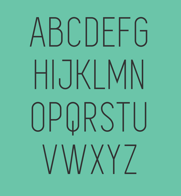
There are such a lot of fonts in the market across the web that usually it’s quite challenging to select the one who would suit your design properly. Today I’d want to bring in your attention a set of 30 really awesome capital free fonts free to download.
Despite any other font types, capital fonts may be used almost everywhere, whatever form of design project you create. Fooling around with width and thickness of the font you could achieve amazing results. So, don’t waste it slow. Scroll down, choose the fonts you adore and download it completely free!
Uni Sans Free

BARON

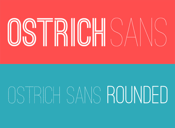
OSTRICH SANS INLINE

Code

Bebas Neue

Blackout

Clutchee

Intro Condensed

SIMPLIFICA
Moderne Sans

Furore
 0
0
Borg
 1
1
Tesla
 2
2
ADAMCG PRO
 3
3
Porto
 4
4
College
 5
5
Mohave
 6
6
Origicide
 7
7
Primus
 8
8
Accent
 9
9
Manteka
 0
0
Rex
 1
1
Dense
 2
2
Reckoner
 3
3
CHE’s Bone
 4
4
UGO
 5
5
Glamor
 6
6
Festa Major de Sant Boi 2014
 7
7
FANCY ME
 8
8
Portica
 9
9
Posted in Web Design
Posted on June 4, 2014 at 4:13 pm
The CSS3 @font-face rule and services like Google Fonts have really spread out the doors for individuals to be more creative with web typography. Google Fonts has over 630 fonts available to make a choice from, and listed here, I’m going to expose you an especially easy solution to use them on your WordPress site – not they all instantly, obviously. Because that will just be crazy.
On the Google Fonts site, they do a superb job of providing instructions which are simple and hassle-free. However, following their instructions requires that you just modify the header.php or functions.php files of your WordPress theme to import the fonts. And you’ll also have to add the mandatory CSS to the way.css file. While this isn’t a very difficult task, there’s a better way.
First, you’ll must download and install the Google Fonts plugin from ThemeTrust. The cool thing about this plugin, is that it integrates directly with the WordPress Customizer, allowing you to immediately see how your typography will look as you put your fonts.

Once you’ve gotten the plugin installed, visit Appearance->Customize, and click the Google Fonts for ThemeTrust tab.

Within the panel, you’ll see eight different sections:
All Text, Paragraph Text, Header 1, Header 2, Header 3, Links, Blockquote, List Item
In each section, you may select a font and set the load for that font. There’s also a field to go into custom CSS selector. So as an instance, in case you desired to only set a custom font for the h3 tags within the footer, you could possibly enter something like this within the Custom Selectors field inside the h3 section: #footer
You also can add multiple selectors by separating them with commas, like this: #footer, #sidebar
Conclusion
As you will discover, it is a much simpler solution for using Google Fonts on your WordPress themes, especially in case you don’t get their hands dirty by editing theme files. And having the choices integrated directly into the WordPress Customizer permits you to quickly see what fonts will and won’t work together with your site.
Posted in Web Design
Posted on June 2, 2014 at 9:19 am
It’s been a long time since Google Plus has changed its design, but i need to say that it’s a rapidly growing social community worth your attention, regardless of what field you’re in. Google has to compete against fully established networks corresponding to Facebook, Twitter and LinkedIn, and as of now, they appear as much as the challenge.
Google Plus is incredibly useful for designers as they’re always working with lots of people on multiple projects and sometimes simultaneously. Usually probably the most easiest ways of maintaining an everlasting communication with the customer is thru email and chat, that is something that Google has mastered with Gmail and GTalk.
Also, it offers you free online video chat using Google Hangouts and a further thing that basically matters, – it’s portfolio feature. The Google Plus app means that you can manage your contacts and content in your mobile device with no trouble. Moreover, Google Plus’ news feed can be a great source of inspiration for designers, especially once you follow the correct people for your niche. That’s why I made this list of 20 creative web designers worth to follow on Google Plus. Scroll down and luxuriate in!
Fabio Sasso
Fabio Sasso is a Senior Designer at Google and founding father of website design blog abduzeedo.com.

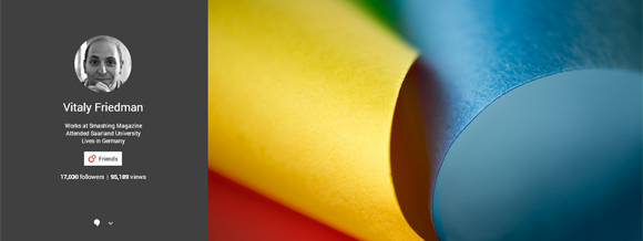
Vitaly Friedman
Vitaly Friedman is a co-founder and editor-in-chief of Smashingmagazine.com, a number one blog about website design and development.

Andy Sowards
Andy Sowards is a qualified web designer, developer, and programmer. He builds websites, brands and relationships.

Alireza Yavari
Alireza Yavari is a graphic designer and e-commerce specialist from Ny. Founder and artistic director of DesignStudio23 The big apple and RecommendedUsers.com.

Graham Smith
Graham Smith is a contract logo designer on the Logo Smith: a symbol design and graphic design studio, providing professionally forged and designed: brand Identities; brand guidelines, apps, software icons, and more.

Ronald Bien
Ronald Bien is an editor and founding father of NaldzGraphics.net website design blog located at Philippines.

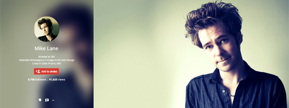
Mike Lane
Product designer and Senior UX architect near Minneapolis, MN with twenty years professional experience in creative UX/UI and interaction design for web, mobile, wearable and emerging technologies with an emphasis on usability, accessibility and web standards.
Leodor Selenier
Leodor Selenier is a graphic designer and illustrator, often called the curator at Bon Expose.

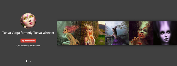
Tanya Varga
Tanya Varga is a contract artist based within the California Bay Area who works with both digital and conventional mediums.She currently works as a contract graphics artist, concept artist and illustrator.
Claudio Cerri
Claudio Cerri works as a contract illustrator for youngsters books, educational books, magazines, comics and advertising. Creative partner of Storybird.com.

Amitay Tweeto
Amitay Tweeto is thequietplaceproject.com creator with an enormous want to change the sector. He’s from Israel.
 0
0
Aaron Wood
Aaron Wood is a designer and illustrator from Massachusetts. Hу consider Google plus as a playground, so you’ll discover a lot of interesting things in his news feed.
 1
1
Khoi Vinh
Khoi Vinh is a graphic and UX designer from Ny, blogger at subtraction.com and a former design director at Long island Times. Not bad, yeah?
 2
2
Cameron Moll
Cameron Moll is the founding father of Authentic Jobs, a targeted job board for web and artistic professionals. He lives in Sarasota, Florida.
 3
3
Jacob Cass
Jacob Cass is a founding father of JUST Creative. On his website you’ll find his graphic works in addition to articles and resources for designers about print design, logo design, website design, branding, typography, advertising and more.
 4
4
Sneh Roy
Sneh Roy is a winner of Best Australian Blog 2013, photographer, stylist, designer. blogger at Cook Republic, and a very good foodie.
 5
5
Louis Lazaris
Louis Lazaris is an author, writer, blogger, and front-end developer based in Toronto.
 6
6
Mirko Humbert
Mirko Humbert is a Swiss freelance graphic and web designer.
 7
7
Veerle Pieters
Veerle Pieters is a Belgian graphic and web designer, author of Veerle’s blog, design lead at Fab, and founding father of Duoh.
 8
8
Chris Coyier
Chris Coyier is an online designer from CSS-Tricks who lives in Palo Alto, CA. Write and screencast about web stuff at CSS-Tricks.
 9
9
Conclusion
As you notice, Google Plus may be beneficial for designers and artists, and another creative people throughout the field. i’m hoping this list I shared above would enable you to remain up-to-date regarding all of the website design news and get inspiration from. There’s a chance I missed out someone really creative on Google Plus, so please, be at liberty to share the links by yourself Google Plus profiles or some prominent web designers inside the comment field below.
Posted in Web Design
« Previous Page — Next Page »