Blog Archives
Posted on December 11, 2013 at 4:11 pm
The internet has been developed to become a powerful tool today as it helps to facilitate
interaction and exchange of global information. A lot of businesses are seeking
the help of website developers Northampton in order to make an impact in the virtual
world. The internet has become a powerful platform where business organisations
communicate with prospects. Hence, the need of a good business website is
imperative.
A lot of businesses commit the mistake of creating mediocre websites. What they fail to
understand is that the website speaks about the business. A business prospect
cannot get in touch with the officials of the company if they have any queries,
so the company websites act as the assistant of the business. One should be
extra careful about choosing a reliable website designer that would create a
professional looking website that serves the business purpose right. There are
indeed many website developers Northampton available around; however, one
should make the right choice by selecting the most reliable and experienced
designer for designing his company website.
There are several factors that one needs to consider when selecting a website developer.
Following are top four reasons that one should take into consideration and make
the decision accordingly.
Technology Platform
– There are different technologies that are used by website designers to create
websites, so you should make sure to check on the one that uses the most
advanced technology platform. The technology platform should also be widely
used so that if any problem arises you can take the help of other developers
too. Some of the common ones are Drupal, Joomla and WordPress.
Portfolio & Design Aesthetics – It is important to check the portfolio of the designer
company you are considering for your designing job. By checking on the past
works of any designer you can have a general idea about the quality of their
work. The portfolio serves as evidence about their experience in the field and
will help you decide better. If they are new to website developing then it is
not a wise idea to hire them for designing your website. If they have a good
portfolio then you can gauge their designing style and see if it meets your
expectations. If you feel that the designer has a reliable portfolio but you do
not like his taste then you should not consider moving forward with him.
Customer
Service – Customer service is very important when it comes to selecting a
designing company. A lot of companies are available when it comes to welcoming
a new client but when it comes to helping them later then they become busy. A
lot of customers need improvements in their websites at a later point of time
but many companies fail to meet their demand.
Cost – The cost
of designing services offered by website developers Northampton is also an
important factor to consider while selecting a developer. You should make sure
that the charges are right and not too high. It is also important to remember
that not all high charging website developers are reliable and similarly, not
all low charging ones are unreliable.
Posted in Web Design
Posted on December 10, 2013 at 8:28 am
Logos are always a superb source of inspiration, especially whenever you be conscious of the small print designers use to symbolize a brand. Whether it’s typography, colors, or white space, there’s always something you are able to learn while observing well designed logos. Because of this today we’ve a suite og beautiful logos to teach you. Enjoy!


 0
0
 1
1
 2
2
 3
3
 4
4
About the Author
 5
5
I love communication, technology, web, design, movies, gastronomy and creativity. Web writer, portuguese/english translator and co founding father of @refilmagem & @mentaway
Twitter: @gismullr
Here’s every other articles that you may definitely find useful.
13 Inspiring Single Page Websites
 6
6
Creative, Beautiful & Thoughtfully Designed Landing Pages
 7
7
13 Beautiful Mobile App Websites
 8
8
Branding: Elegant and provoking Examples
 9
9
13 Beautiful Illustrated Websites
 0
0
Posted in Web Design
Posted on December 8, 2013 at 3:35 pm
Single page websites were a well-liked trend for it slow now, and their popularity doesn’t seem losing any momentum. Going this route isn’t right for each project, but there are occasions when it’s fitting and just is sensible. For instance, when there isn’t lots of content, and also you know the content won’t be growing a great deal sooner or later, it may possibly is smart to compliment a single page design. It’s also an effective way to have interaction the user with various effects because the page is scrolled.
For this post, we’ve gathered a set of well designed single page sites that ought to come up with a variety of inspiration on your next project.
150 Pixels

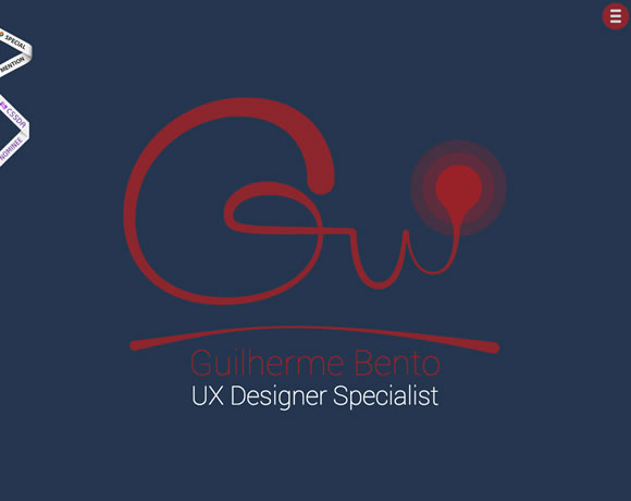
Guilherme Bento

Create Pilates

Fluger Design

Paul Landon

Adsy

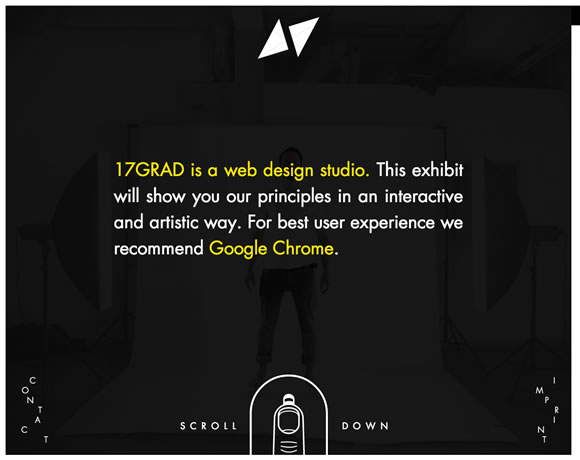
17Grad
hi hayk

Wrist

Robby Leonardi

Tonnelier
 0
0
soyouwanttogotorisd.com
 1
1
Julien Tome
 2
2
About the Author
 3
3
I love communication, technology, web, design, movies, gastronomy and creativity. Web writer, portuguese/english translator and co founding father of @refilmagem & @mentaway
Twitter: @gismullr
Here’s any other articles that you’ll definitely find useful.
Creative, Beautiful & Thoughtfully Designed Landing Pages
 4
4
13 Beautiful Mobile App Websites
 5
5
6 Valuable Tutorials for Web Designers
 6
6
Branding: Elegant and provoking Examples
 7
7
13 Beautiful Illustrated Websites
 8
8
Posted in Web Design
Posted on December 6, 2013 at 2:22 pm
Here at WDL, we adore to browse the net find good freebies for you, especially fonts. Good typography is something every designer must be involved in, and having a various choice of fonts makes it that much easier. With that during mind, we’ve gather six excellent free fonts as a way to add on your design library.
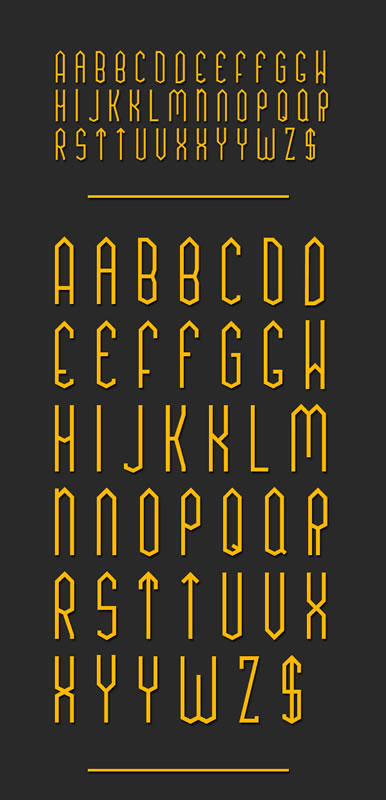
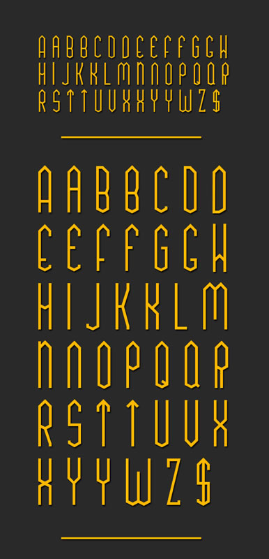
TUA Type


Pancetta Pro
Free versions are: Regular & Italic, but you should definitely check all other versions.


Glamor
You must visit dribbble to get the font.


Sketchetik Fill
Free version: Ligth, but be sure to check all other versions.


Adria Grotesk
Free versions: Adria Grotesk, but be sure to check all other versions.

 0
0
Klaus FY
Free versions: Medium, but be sure to check all other versions. The font Klaus FY Medium would be free till Jan 2 2014 only.
 1
1
 2
2
 3
3
About the Author
 4
4
I love communication, technology, web, design, movies, gastronomy and creativity. Web writer, portuguese/english translator and co founding father of @refilmagem & @mentaway
Twitter: @gismullr
Here’s every other articles that you’ll definitely find useful.
9 Free PSDs for Showcasing your Design Work
 5
5
9 Stylish Free Fonts on your Designs
 6
6
14 Colorful Autumn Wallpapers
 7
7
8 Fresh Free Fonts on your Designs
 8
8
10 Free PSDs for Perspective App Mockups
 9
9
Posted in Web Design
Posted on December 4, 2013 at 2:36 pm
As the saying goes, you simply have one chance to make a primary impression. This can be a lesson that’s very important to bear in mind when you’re a startup and you’re engaged on your landing page. Nearly all of landing pages accessible have a couple of key goals – to notify visitors concerning the product, to construct excitement for that product and to have a transparent next step, akin to identifying more, signing up or buying the service.
But needless to say, it isn’t so simple as that. A well laid out design can help to speak those elements more effectively, while a more visually appealing site design might help so as to add some professionalism, which might reflect positively at the product itself. Even though the product itself looks and works perfectly, if the landing page that promotes it looks wrong, then there’s a superb opportunity that it won’t convince as many visitors and plenty of people could find it off-putting.
I desired to assemble a set of a few of my favourite landing page designs. Each of those examples blends great design, with a transparent call-to-action and enough copy to construct excitement and interest. I’d like to know which of those you discover best, and in case you know of any others that should make the list – make sure to let us know about them inside the comments.
Chartbeat
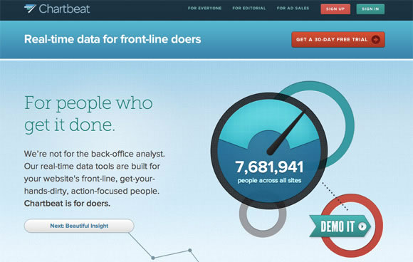
Chartbeat is a genuine time analytics product that helps website owners see where traffic comes from and what visitors are doing because it happens. Their landing page is stunningly designed and uses interesting copy, all presented using parallax scrolling and clever animations.
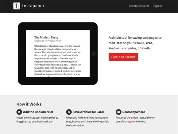
Instapaper

Instapaper is an app for you to save websites to read later. The design of the landing page mirrors that of the app itself – it’s clean, easy to read and uses minimalism and white-space to declutter, and present only the ideas you might want to see.
Coin
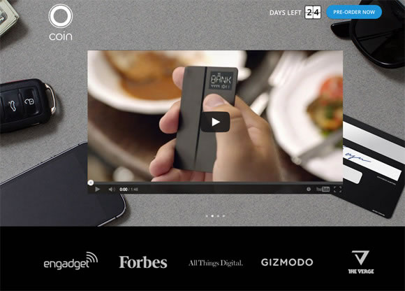
Coin is a brand new startup that promises to dispose of bank cards and store cards, by utilizing an electronic card that may store them all. Their landing page specializes in their promotional video to assist describe the theory, but in addition uses quite a few animations tied to the scroll function which will help present the product in an innovative and straightforward to appreciate way.
Harvest
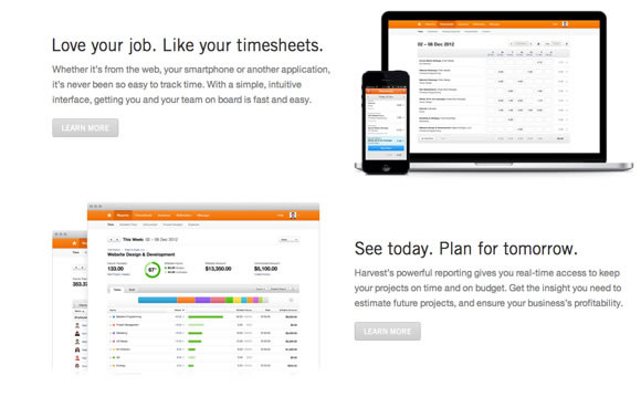
Harvest is a time tracking tool designed for businesses and freelancers. Their landing page includes a breakdown of the functions of the tool, nicely separated with white-space to create a clean, calm effect. The copy have been kept informative yet short, so it’s easy to digest and the page helps to reveal off the interface of the product beautifully.
Squarespace Apps
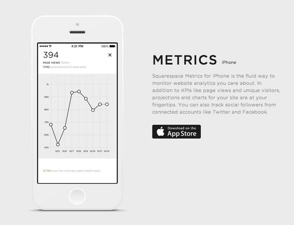
Squarespace – the web site publishing platform – have released a set of mobile apps designed to make blogging, publishing and analysing your Squarespace site easier. The landing page for his or her mobile apps is modest, uncluttered and clear, and they’ve put a ton of focus into the visual aesthetic and design of the promoting page itself.
Simple
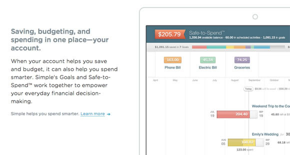
Simple aims to exchange your bank by offering a Visa card that hooks into it’s software. It helps to trace what you spend your money on, allows you to save and gives a wide selection of software-based features. The landing page for the service helps to reveal off the advantages clearly and concisely and keeps a minimalist aesthetic while still providing quite a lot of information.
Plentific
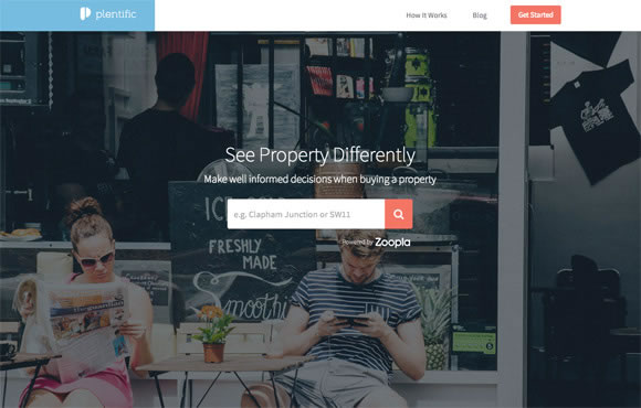
Plentific helps people wanting to buy a house by offering a number of advice, tips and monetary tools. The landing page uses big, bold imagery to attract you in, but scrolling down reveals a wealth of knowledge – all presented beautifully.
Thinglist
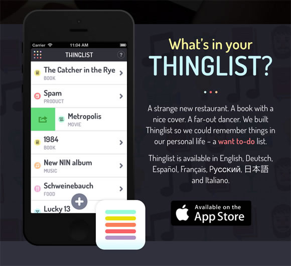
Thinglist is an engaging tackle a to-do list, by instead being a “want to-do” list. Designed by the team at Elepath, Thinglist’s landing page within reason minimalist, but has a bright, colourful visual style that contrasts nicely with the dark background.
Amp
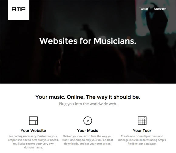
Amp is a device that helps musicians create websites for themselves, no coding necessary. It’s rare to locate a landing page that’s entirely in black and white, but Amp has pulled it off – the result’s a clean, elegant and easy design that appears fantastic.
Readymag
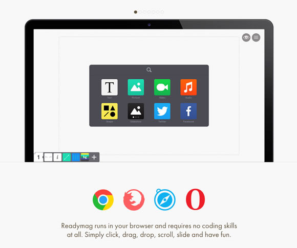
Readymag is a drag-and-drop website creator that makes it easier to create microsites and online magazines. The landing page utilizes a flat design aesthetic together with big, bold typography and a varied colour palette.
Droplr
 0
0
Droplr is a file sharing tool designed for businesses, just like Dropbox, to assist make it easy and secure to store and share files across a whole company. Their landing page makes a fascinating use of illustration to subtly add slightly personality.
Exposure
 1
1
Exposure, also from the Elepath team, is a device for photographers to assist blow their own horns their work within the form of a blog post, in order that all their photos interact to inform a narrative. The landing page for the product uses lots of white-space to split each element, and is clean, minimalist and chic.
Sketch
 2
2
Sketch is a vector graphics tool that many designers are leaving Photoshop and Illustrator for. It’s landing page is slightly more cluttered than the examples above, but they’ve taken each benefit to using their software and feature undergone it intimately together with examples, leading to a radical yet beautiful marketing site.
AppDock
 3
3
AppDock is a yet-to-be-released App marketplace, built with developers in mind. The landing page has a truly distinct and quirky style with the usage of illustration. It’s unusual elements like this in a landing page which could help to make it memorable.
Marquee
 4
4
Marquee is a publishing platform designed for artists, writers and bloggers to assist assist you to get their content live. The landing page uses a gorgeous, flat style and launches straight right into a fast loading product demo, that’s instantly engaging and engaging.
Which of those landing pages do you love best? Have you learnt of another marketing page designs that you simply think deserve an honorable mention? We’d like to hear your thoughts inside the comments.
Here’s every other articles that you may definitely find useful.
13 Beautiful Mobile App Websites
 5
5
6 Valuable Tutorials for Web Designers
 6
6
Branding: Elegant and provoking Examples
 7
7
13 Beautiful Illustrated Websites
 8
8
In RWD We Trust – Is that this trust misplaced?
 9
9
Posted in Web Design
Posted on November 30, 2013 at 3:34 pm
Mobile app websites, when properly designed, are source of design inspiration. From beautiful images to excellent use of white space, typography, and colours, it appears that designers will go the additional mile to create something nice and unique to advertise their app. So for this post, we’ve gathered some beautiful examples of mobile app sites that may certainly offer you some ideas on your next project. Enjoy.
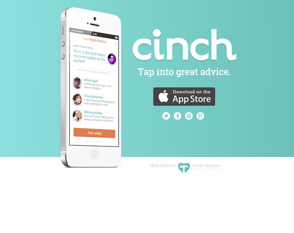
Cinch
Whether you’re redecorating your house, gardening, furniture shopping, parenting or raising pets — Cinch has the folk with great advice to make every decision easier. Just tap in a query, and we’ll connect you to the folk with the appropriate advice.
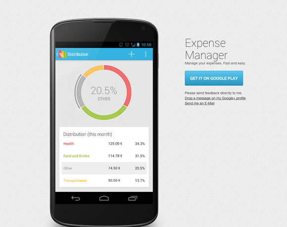
Expense Manager
Manage your expenses directly for your smartphone. Easily keep track of your finances.
Shares
Shares provides you with an easy overview of all of the companies you have got invested in.

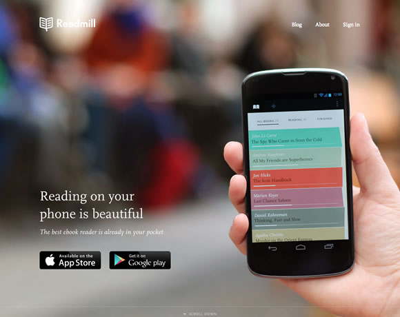
Readmill
Readmill is a gorgeous ebook reader that permits you to read and share books. Try it and discover how great reading books in your phone or tablet would be.
ep1c

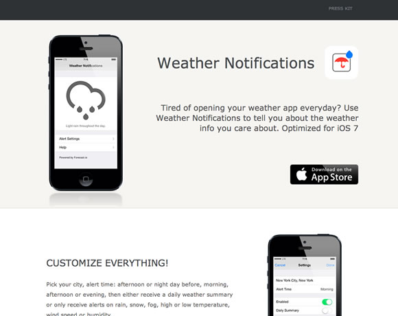
Weather Notifications
Weather Notifications helps you to schedule and receive custom push notifications for weather info.
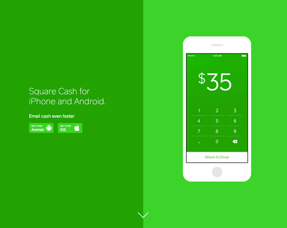
Square Cash
Send money to anyone with an email address. It’s fast, safe, and free!
Sunrise
Sunrise is a free calendar app made for Google Calendar users. Designed with love, Sunrise is a brand new experience so one can make your life easier.

Circa
Save time. Stay informed. Circa is learn how to read and follow news at the go.

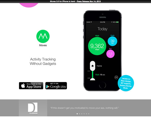
Moves
Moves automatically tracks your way of life and exercise. Just carry your phone to your pocket or bag.
Aviate
Aviate automatically categorizes all your apps, and intelligently rearranges your homescreen inside the day to dynamically provde the apps and knowledge you wish to have most, at exactly the moment you’d like it.
 0
0
Event Book
Event Book is a free, simple, and fantastically re-imagined calendar app. With usability and straightforwardness in mind, Event Book’s themed interface, customizability, and maps, weather, and site integration make it easier to more easily manage your life.
 1
1
Shindig
 2
2
Here’s another articles that you’ll definitely find useful.
6 Valuable Tutorials for Web Designers
 3
3
Branding: Elegant and galvanizing Examples
 4
4
13 Beautiful Illustrated Websites
 5
5
In RWD We Trust – Is that this trust misplaced?
 6
6
17 Web Designs with Big Photography
 7
7
Posted in Web Design
Posted on November 28, 2013 at 12:53 pm
Designers always must be on top in their game to deliver great projects. From maintaining a tally of everything that may be new to always improving your techniques, you definitely have to be tuned to ways you may keep improving. That will help you on that task we gather a couple of tutorials for you to certainly make your life easier. Test it out!
About the Author

I love communication, technology, web, design, movies, gastronomy and creativity. Web writer, portuguese/english translator and co founding father of @refilmagem & @mentaway
Twitter: @gismullr
Here’s another articles that you’ll definitely find useful.
Posted in Web Design
Posted on November 26, 2013 at 12:42 pm
As the choice of smartphones continues to skyrocket, the significance of mobile website design grows alongside it. Web designers are actually forced take into consideration mobile users and mobile devices when designing websites. The smaller screen size of smartphones forces designers to take a brand new solution to user interface elements. Elements and styles that work well on desktop can appear broken when viewed on smartphones. User friendly form inputs that encourage completion and submission are essential when designing a pretty good mobile friendly website. Today we shall check out the way to design attractive and user friendly form elements and inputs.
Labels
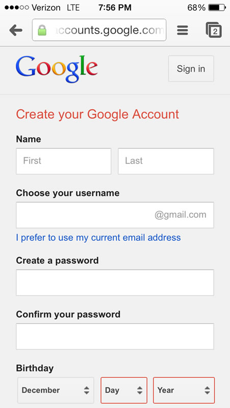
First we’ll start with designing and selecting the right location on your input’s labels. Choosing a location to your mobile input labels is critical and if you’re not careful they might not be visible or may present problems on your mobile user. Labels to the left or right can easily be bring to a halt so it is usually best to top or bottom align mobile input labels. Field zoom can exacerbate the matter by removing labels when zooming in. Short labels also are recommended as screen size is a crucial asset and long labels will often be compromised by field zooming. Because the image below shows google aligns their input labels on top to be certain they don’t seem to be bring to a halt.
Elements
Due to the smaller screen size of mobile devices it’s necessary to keep the shape so simple as possible. A method to reach this by combing elements into one field or by removing unnecessary ones. As an example in place of requiring street, city and zip you can simply ask for the address. By reducing the variety of elements and simplifying the shape you can quickly and simply improve your user’s mobile experience. Another option to simplify your mobile form is by removing unnecessary inputs and keeping only what’s truly needed for the shape. For instance if in case you have a kind that asks for name, email, message and the way you heard about us consider removing the the way you heard about us field. It’s unnecessary and only complicates the shape. Removing it allows the user to accomplish the shape easier and increase the likelihood of the shape being submitted. Descriptive tags and links may also be removed for you to free screen space and improve your forms usability.
Orientation
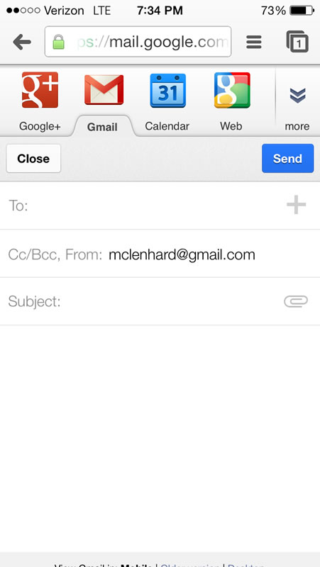
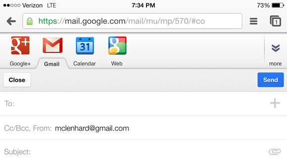
The orientation of a mobile device drastically changes the viewing dimensions and it is vital to take changes in orientation into consideration when designing your mobile forms. It’s necessary to test your form in both orientations to ensure your users won’t face any problems when filling out your mobile form. Google does this well of their Gmail web application and when your phone changes to portrait landscape the screen adapts to provide a much broader text box.
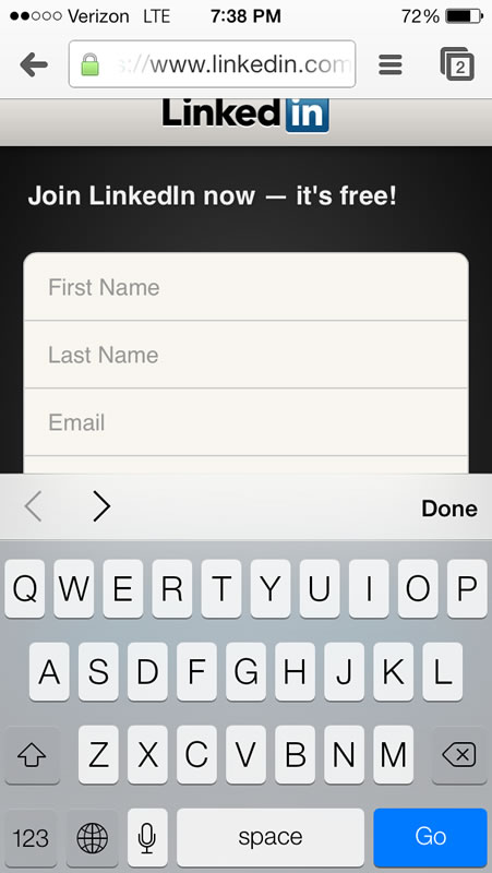
LinkedIn shows you what can get it wrong when designing inputs for mobile devices. After clicking on an input after which switching orientations the keyboard dominates the screen and you may now not see what you’re entering.
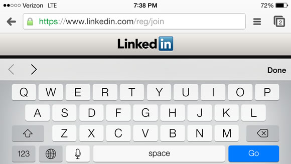
As mobile device usage continues to grow innovations can be made in mobile web. The mobile web continues to be in its infancy and it’s exciting to determine what’s to return.
Here’s another articles that you’re going to definitely find useful.
How to construct an internet site that Adds Value for your Brand

The Smartphone Face Lift: Is Apple’s Design Too Trendy?
Embracing Technology for Better Experiences
20 Resources for amateur Designers & Developers
6 Not-So-Obvious Mistakes Freelance Web Designers Make
Posted in Web Design
Posted on November 24, 2013 at 7:33 am
The visual representation of your brand is something that shouldn’t be taken lightly. When given the right attention, it may certainly make a huge impact. Whether you’re deliberating redesigning your individual brand or making a new one for a consumer, we’ve gathered some branding projects which are extremely well done, and will provide lots of inspiration.
About the Author

I love communication, technology, web, design, movies, gastronomy and creativity. Web writer, portuguese/english translator and co founding father of @refilmagem & @mentaway
Twitter: @gismullr
Here’s another articles that you’ll definitely find useful.
Posted in Web Design
Posted on November 22, 2013 at 4:22 pm
A lot of trends in website design come and go, but illustrations always stay around and are as a way to give your site a singular look and grace. Today we’ve some beautiful examples of web sites that effectively use illustrations so as to add personality and grab the user’s attention. From small and subtle illustrated details to totally illustrated backgrounds, there are a lot different approaches you could take when using this style. We’re confident that you could find some inspiration in these sites in your own projects.
About the Author

I love communication, technology, web, design, movies, gastronomy and creativity. Web writer, portuguese/english translator and co founding father of @refilmagem & @mentaway
Twitter: @gismullr
Here’s another articles that you’ll definitely find useful.
Posted in Web Design
« Previous Page — Next Page »