Blog Archives
Posted on November 26, 2024 at 2:29 pm
Web design is all about creating websites people love to use. It starts with careful planning, moves through creative design choices, and ends with a site that works brilliantly for its visitors.
Think of Northampton Website design like building a house. You wouldn’t start putting up walls without a solid plan. The same goes for websites. Good designers spend time understanding what the site needs to achieve and who’ll be using it. They sketch out ideas, plan the structure, and map how people will move through different pages.
The best websites feel effortless to use. You click, you find what you need, you move on. That’s not accident – it’s careful design at work. Designers obsess over every detail, from where to place buttons to which colours will guide your eye across the page. They’re constantly asking: “Will this make sense to our visitors?”
Navigation sits at the heart of great web design. Nobody likes feeling lost on a website. Clear menus, logical page structures, and obvious paths forward keep visitors happy and engaged. Smart designers make sure you can always find your way home with just a click or two.
Colours do more than make sites look pretty – they create mood and guide actions. A bright orange button draws attention to “Buy Now.” Calm blues build trust for banking sites. Even subtle colour choices affect how people feel about a website and the company behind it.
Typography matters just as much as colour. The right fonts make reading easy and pleasant. Too many fonts turn a page into visual chaos. Web designers usually stick to two or three complementary fonts – perhaps one for headlines and another for body text. They choose fonts that work well on screens and stay readable on mobile phones.
Images and white space work together to create breathing room. Cramming too much onto a page overwhelms visitors. Thoughtful spacing lets important elements stand out naturally. It’s like arranging furniture in a room – you need empty space to make the important pieces shine.
Every website needs to work perfectly on mobile phones. More people browse on phones than computers now. Good designers build sites that adapt smoothly to any screen size. Buttons grow larger for finger taps. Menus reshape themselves. Images resize automatically. The whole experience stays smooth whether you’re on a tiny phone or a massive desktop monitor.
Speed counts. Slow websites frustrate everyone. People expect pages to load in seconds – they’ll leave if they have to wait. Smart design balances beautiful features with fast performance. That might mean optimising images or streamlining code. The goal is a site that feels snappy and responsive.
Accessibility isn’t optional. Websites need to work for everyone, including people using screen readers or keyboard navigation. Good designers build sites that welcome all visitors. They add alt text to images, ensure proper colour contrast, and create logical structures that make sense even without visual elements.
Testing reveals what really works. Designers watch how people use their sites, spot problems, and make improvements. They might notice visitors struggling to find the contact page or getting confused by a form. Each observation leads to refinements that make the site better.
Web design never truly finishes. Sites need regular updates to stay fresh and relevant. New features appear, brands evolve, and user expectations change. Good designers plan for this evolution from the start, building sites that can grow and adapt over time.
The technical bits matter too. Clean code makes sites easier to update and faster to load. But good designers never let technology drive decisions. They focus on what visitors need, then find the best technical solution to deliver it.
Content plays a massive role in design success. The most beautiful site falls flat without clear, helpful content. Designers work closely with writers to present information in the most useful way. They consider how to break up text, where to add images, and how to guide readers through complex information.
Branding ties everything together. Every design choice – colours, fonts, images, tone of voice – should reflect the brand’s personality. A playful brand needs different design choices than a serious professional service. The best sites feel authentic to the companies they represent.
Success comes down to serving visitors well. Do they find what they need? Can they complete tasks easily? Do they leave feeling positive about their experience? These questions guide every design decision.
Web design blends art and science. It requires creativity to make sites beautiful and engaging. It needs technical skill to make them work smoothly. Most importantly, it demands deep understanding of how people behave online. When all these elements come together, the result is a website that delivers real value to everyone who visits.
Posted in News
Posted on April 28, 2019 at 10:12 pm
Calls to action are used on a website to help you direct a user through your content and take the right action from it. They help to shape a user journey, something that is so important when you want your website to do a job for you. Deciding on the calls to action you will use, and the ways in which you will position them, will help you to achieve results.
Above all, your calls to action need to be clear and easily interpreted. Everybody who enters your website needs to be able to understand what they need to do and how they are meant to behave based on your website content. If you want somebody to call you, or send you an email, make sure they know that they should do this and have all of the details to do so. The same goes for an eCommerce website; make sure people can buy what they want.
Posted in News
Posted on January 30, 2019 at 7:04 am
A website isn’t something that lasts forever. You will probably be very happy with it when it goes live, and when it does everything that you want it to do. But it will age, and website design trends will change, and functionality will change, so you might feel your website is no longer doing what you need it to do. This is perfectly normal, and the average lifespan of a website is a few years, before it begins to look outdated.
Speak to your web design agency. They might be able to give you a website refresh for a lower price, especially if you already have lots of photos they can use and you already have the copy on your existing website. It is well worth the money to update your site when it is starting to feel old or tired; you will once again be able to be up there with the competition.
Posted in News
Posted on June 23, 2015 at 4:02 pm
Just like fashion, web development is changing rapidly with new fads and tends coming and going. When it comes to development of a website with a professional impression, you must keep everything updated and on the trend. Here are some tips to develop a professional website.
Keep in clutter free and clean
The modern world is a bit cluttered and the internet is no exception. Banners, icons, Ads, signs and buttons can get quite heavy. So you need to safe your site visitors from all the clutter and noise. The most effective way is to embrace things like white space and flat design. This will give your visitors great experience as they navigate your website. Keep your site simple with the most crucial content spotlighted.
(more…)
Posted in Website Development
Posted on March 20, 2015 at 4:21 pm
Creating a clean and professional website is one of the greatest hurdles that online businesses face today. Due to the stiff online competition, you should never fail to make a powerful impression with your home page. On the other hand, be careful with whatever you include on your website since some of your actions may instead put your online business in jeopardy. Below are a few simple mistakes that UK website developers advise that you should never expose your website to as much as possible.
Creating a Jumbled Site
Trying to pick the right information from a jumbled website is overly strenuous. For this reason, you ought to make things easier for your clients by being very selective on what to display on your website more so on your home page. Additionally, you should further abridge everything for your clients by arranging your data coherently and in a presentable manner. Avoid jamming your homepage with too much information since this would only create a mess. Moreover, not every piece of information can be represented on your homepage. (more…)
Posted in Web Design
Posted on January 23, 2015 at 7:24 pm
Everyone is building a website these days. Some are doing it for fun while others are purely into it for the money. Whatever your reasons may be; If you have asked about web design in Milton Keynes, you probably have heard stories of people who went through horror-like experiences with a web developer. If this has happened to you or if you want to avoid such circumstances; read on. In this article we provide you with the necessary tips to help you and give you the insight you need to make the right decisions as you hire your next web designer. To make it easier for you to grasp, we have outlined the top 4 things to consider look for in a web designer.
Ask
Web design in Milton Keynes is not a new thing. Your problem is finding the right guy and the best way to get a hold of this person is by asking around. Other people who have passed down this road probably know a web designer that is worth it and they will be more than happy to lead you to his direction. If you have nobody to ask, seek the services of search engines or social media websites. A good designer always has the backing of his previous clients. (more…)
Posted in Web Design
Posted on October 26, 2014 at 7:34 am
Looking to build a new site for your business? Today, a website is literally a must have for businesses. Apart from giving you a competitive edge, it offers an effective way to connect with your target market and establish your brand. When it comes to the web design part, many business owners prefer to hire website designers in Milton Keynes. This is not necessarily because they can’t be able to perform the job, but because of the numerous benefits they stand to gain by having a professional handle the work. Here are some of them.
- Are experts
You understand your industry very well. You know what works and what doesn’t, what can bring you more sales and what can’t, and so on. The point is that you’re an expert in that particular industry. Web designers are also the experts in their own industry! They speak, research and do the web. A professional designer will have undergone all the required training to work in the field. Moreover, they stay up to date with trends and advancements in the world of web design by continuously researching, reading blogs and attending seminars, for instance. They will also have vast experience building and designing sites for many different clients. (more…)
Posted in Web Design
Posted on September 17, 2014 at 2:27 pm
Moving on from our article regarding email marketing, check this post for our rundown on getting started with email marketing company MailChimp.
Before you start creating your first campaign, build up your list of email contacts, also known as ‘subscribers’. Create lists depending on clientele. So you know who to aim which campaign at easily, whilst also having a list for all of your contacts.
Next part is actually building the campaign, which can be done either with a visual editor or HTML. After you’re happy and send away, you can view how successful your campaign was by tracking your subscriber engagement. MailChimp shows when an email was open or closed, and you can also link it with your Google Analytics account for even more in-depth reporting.
Posted in News
Posted on June 23, 2014 at 8:45 pm
One of the most amazing things about e-mail marketing is that you do not have to be an expert to create a good looking campaign. Majority of e-mail marketing service providers provide pre-designed templates for their clients to use. However, with already designed templates, you have a number of design decisions to make for instance the fonts to use, the colours, the size to make the fonts and also the text you should include. The following are some of the best Email marketing design tips you should know.
Include your logo each time in the same location
It is important to build your brand with every marketing electronic post you send. The best way to do this is by including your logo in all your communications in the same location. You might include it in the header or somewhere within the message. However, do not conceal it completely as this will prevent the reader from seeing it.
Always have the preview pane in mind
A study conducted by Marketing Sherpa shows that 70% of recipients with the ability to read an email through a preview pane actually do. This means that not all of your subscribers do actually read all your mails. Therefore to ensure that they read most if not all your messages, it is essential to include your logo as well as including some enticing information about what is contained in the email in the preview pane. This will get them interested into reading what is contained in your message.
Use colour for emphasis
Although it is good to use colour in your mails it is important to resist the urge to over use the colours. Use of a lot of colours might make your piece of mail look ugly and unattractive to your subscribers as well as readers. If you want to use colours it is advisable to use your company’s colours; colours that represent your brand. But for emphasis you can use colours that are outside your brand. You can use these unique colours to point out important things in your message for the reader to see, read and understand that particular thing with ease.
Reduce the number of fonts you apply
The recommended fonts to use for the best email marketing design are two fonts. For example you may use standard fonts like Times New Roma, Verdana or Arial. This is because they make it easy for the reader to see and read the contents of your message with ease. If you use or apply fonts that are less common, the computers of your subscribers and recipients might make substitutions that can entirely change the format of your electronic message.
Be precise and concise
When it comes to proper email marketing design, it is a good idea to always go straight to the point. It is important to point out that most people scan through messages they receive. They rarely give you the opportunity to capture their attention. Therefore if you go round in circles and fail to engage them you will definitely lose them. The first few words of your mail should be enticing and captivating to get your audience reading the remaining parts of the message.
Posted in Web Design
Posted on June 12, 2014 at 9:23 am
Designers, engineers, architects, and other creatives spend a lot of the day in front in their computers. It truly is where your complete work gets done, social relationships are made, and emails get treated. In point of fact, laptops and computers became a staple of recent lifestyle, and folk use much more devices to make their work more productive.
Today, I’d want to bring on your attention to twenty awe-inspiring and neat examples of sites with workspaces within the background. A whole bunch digital agencies, interior and website design studios, magazines, freelance workers, and people use their workspace as a background in their websites to indicate off where all of the creative ideas get born. It’s a special chance to take a look on the backstage of the creative process. Scroll down and revel in!
Electronic Brain

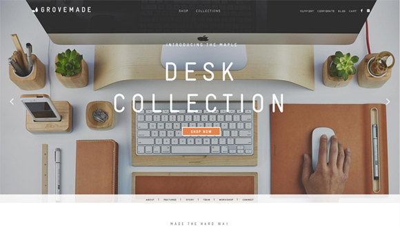
Grovemade

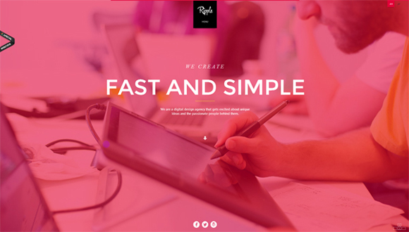
Ripple
Clever Birds

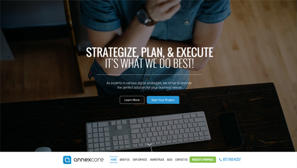
Annexcore
Love Carmen Rose

Loyalty Expert

Bright Byte

GCM Service Group

JK Design

The ABC of Cinema
 0
0
KIN
 1
1
New Deal Design
 2
2
Multifarious Engineering
 3
3
Cinnamon Toast
 4
4
Squarespace
 5
5
Online Department
 6
6
BKWLD
 7
7
Wearemammoth
 8
8
Best Designers Ever
 9
9
Posted in Web Design
Next Page »